In a previous article, we’ve shared a global online Covid-19 map that shows how many cases of the virus, deaths, and recoveries have been recorded in which country, a handy tool that helps you understand the spread of the virus globally. However, with time, as the virus began to expand worldwide and infiltrate the most remote communities in the world, a need for a tool that would help you assess the risks catching the virus locally has emerged.
In some countries, especially those that have been especially successful in combatting the Covid-19 pandemic, local governments and private IT companies alike have developed online maps that help locals track the spread of the virus in specific cities or even neighborhoods, but the United States has been much slower in developing such a system. Only recently, at the beginning of July of 2020, the Harvard Global Health Institute (HGHI) launched an online map that consolidates Covid-19 statistics across the United States. Without a doubt, this tool will be useful for both local and state governments and private residents. To learn more about this map, simply continue reading.
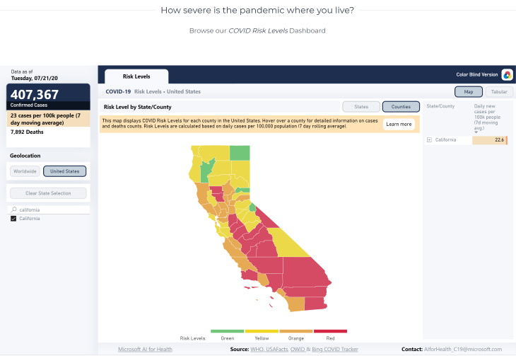
As mentioned previously, the map has been created by the Harvard Global Health Institute (HGHI) and it intends to provide an easy-to-understand risk assessment of emerging regional flareups of Covid-19 in specific states and counties. There is also a worldwide statistics page, but it is not as specific and will only provide rough, countrywide estimates of most places abroad.
The map is color-coded, with regions that appear in green having the lowest risk of Covid-19 at the moment, yellow and orange having low-medium and high-medium risk, and red areas having the highest risk of catching the virus to the point that it may require a stay-at-home order. These numbers are, of course, dynamic and are continuously updated. In terms of numbers, a community with less than 1 new daily case in 100,000 people is color-coded green, 1-9 corresponds with yellow, 10-24 is orange, and anything above 25 is color-coded red.
The map also showcases certain statistics in the top left corner, such as the number of confirmed cases, the number of deaths, and the average risk during the past week. Searching for a specific state and selecting a county is easy: simply type in the state of interest in the search field at the bottom-left part of the screen, and the map of the state will appear.
In the example above, you can see the map of California (as of July 23, 2020). You can then click on any specific county and the risk and stats for that county will appear on the left of the screen. You can also simply hover over the country to see the same statistical information.
As you may imagine, this map will help you assess how severe the spread of Covid-19 is in your county, and whether or not you should plan outdoor trips in your area or any nearby county or state, for example. Keep in mind, however, that a green color-coded area doesn't necessarily mean your area is free of the virus, so make sure to abide by minimal requirements like mask-wearing, social distancing, and hand-washing at all times. We hope it will help you understand your risks and make living in these dangerous times easier.
If you're interested in trying out this useful map for free, you can do so by simply visiting the following website through this highlighted link: COVID-19 Risk Level Assessment Map
Share this informative article with family and friends!
Subscribe and REMOVE ALL ADS
LOVE our articles but HATE our ads? For only $3.89 per month, enjoy a seamless, ad-free experience that lets you focus on what matters most — enjoying all of our content, uninterrupted. 🔒 100% Secure Payment 📅 Cancel Anytime, No Strings Attached Unlock a cleaner, faster browsing experience today and gain the freedom to navigate without visual clutter.
Ready for a Ad-Free experience? Upgrade now for just $3.89/month!
To enable your Ad-Free Subscription, please fill the fields below
Thank you for your subscription!
Your subscription was successful, now you can enjoy an ad-free experience!! Note: To make sure you get no ads, please make sure to log in to your account. If you are logged in already, then refresh the page. The subscription can be cancelled at any time.
This content is reserved for our members
Join Our Community for FREE and Enjoy:
Full and free access to ALL content.
The 'Daily Mail' service sends the highest quality and the most fascinating content directly to your inbox.