The USA is without doubt a fascinating country. When the data is collected on it and its inhabitants each year, there's a whole myriad of information to be learned. Take a look at the following 22 maps that show the US' demographic makeup in detail - who knows? You might learn something entirely new:
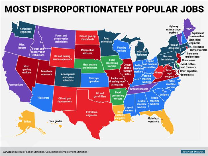
This map shows which jobs are held at a disproportionately higher rate in each state compared to the rest of the country.
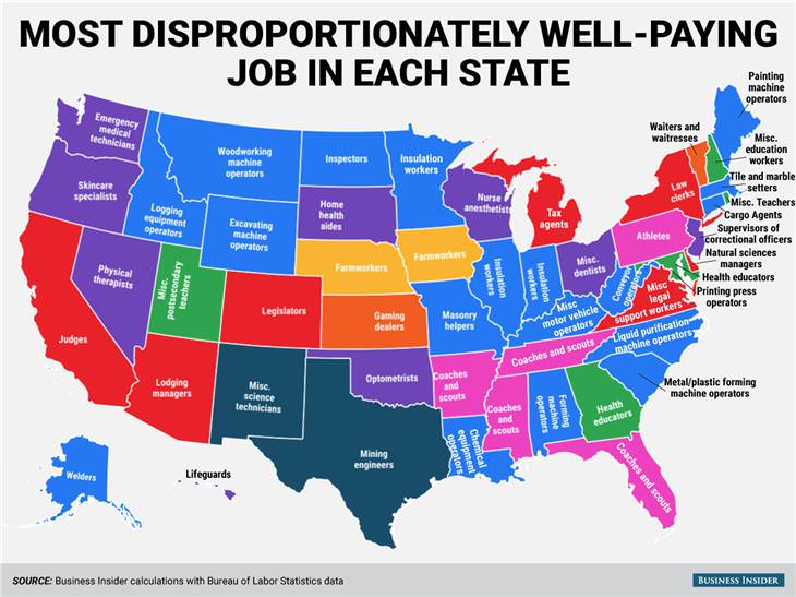
This map shows which jobs pay disproportionately high salaries in each state relative to the rest of the country.
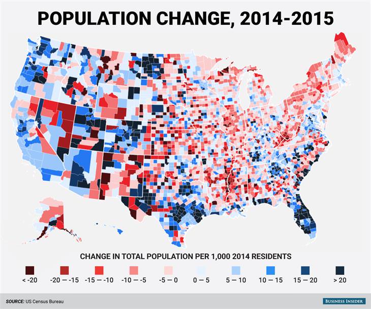
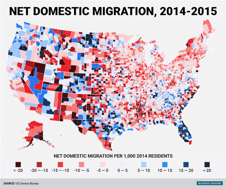
Americans are always on the move. This map shows the overall population change in the country from 2014 to 2015.
The western part of the country, together with its oil-rich regions, experienced a population increase. Northern counties and Appalachia experienced the opposite.
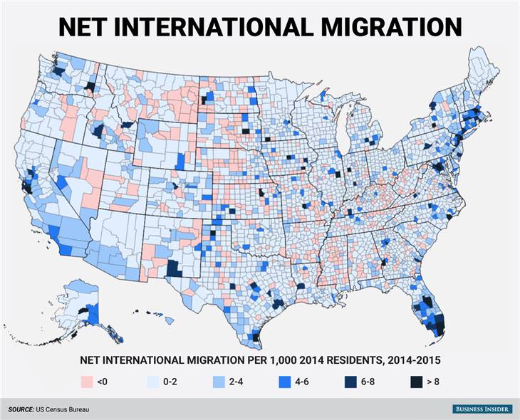
San Francisco, New York and Miami were among the coastal cities that had a lot of immigration from other countries.
The north eastern part of the country had more people moving out than moving in, whereas southern states such as Texas and Florida had an influx of domestic movers.
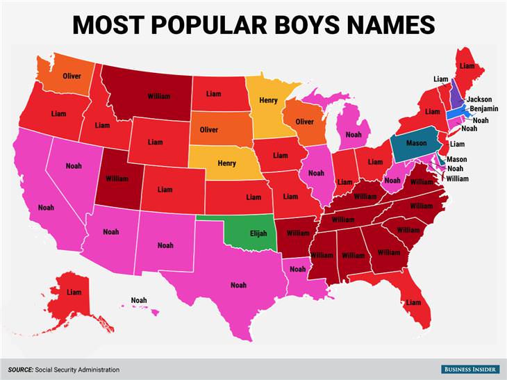
This map shows the most popular boys’ names in each state.
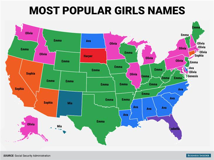
During 2015, it was clear that Emma was the most popular girls’ name in the USA.
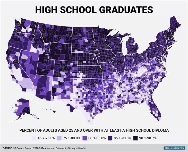
Many of the southern states still have low high school graduation rates, highlighting the USA’s educational inequality.
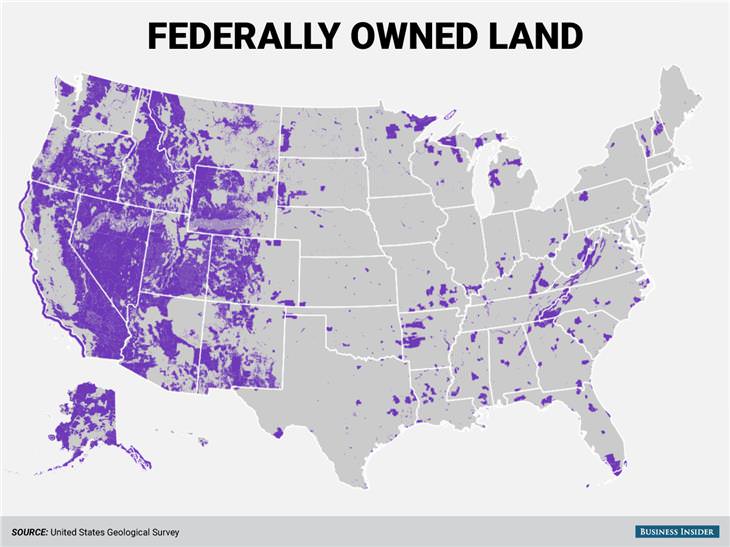
The US government still owns vast swathes of the country’s land. Federally-owned land is highlighted in purple.
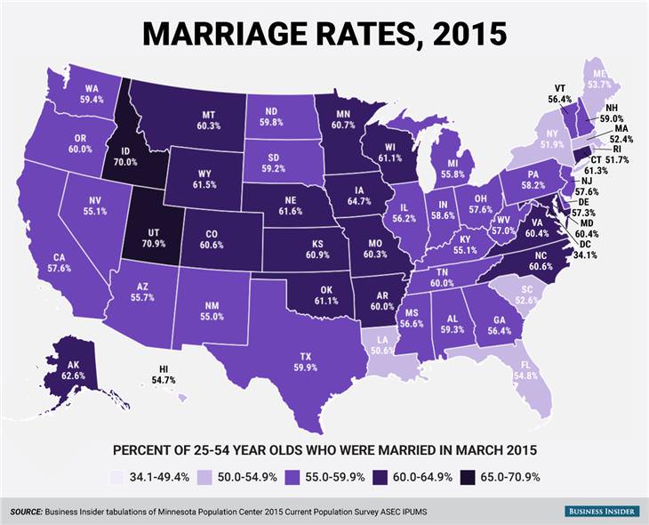
This map shows that the US heartland has much higher marriage rates when compared to the rest of the country.
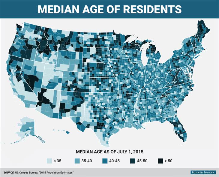
Northern areas of the US tend to have an older population on average, whereas southern and western areas tend to have young populations on average.
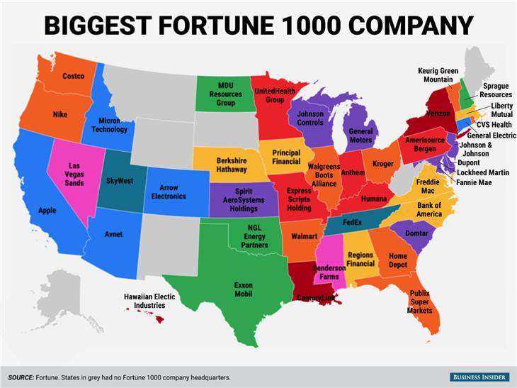
There are large publicly-traded companies headquartered in many US states.
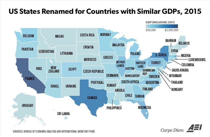
The gross domestic products of individual US states are comparable to gross domestic products of whole countries.
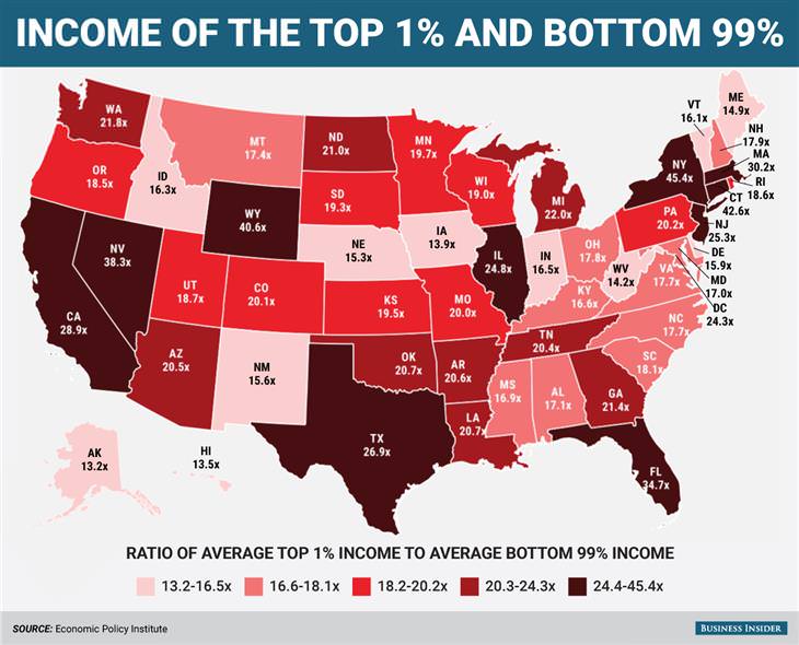
This map shows that there is marked income inequality across the whole country.
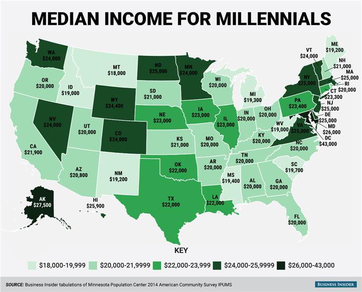
Millennials make a lot more money on average in certain US states than they do in others.
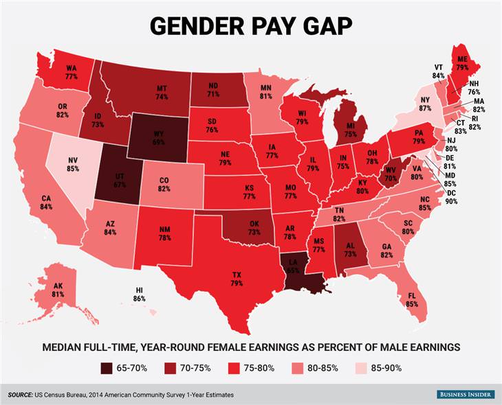
There are three US states in which the gender pay gap is more pronounced than in the others.
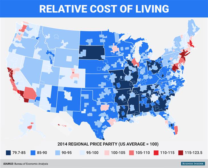
Big coastal cities are the most expensive places to live in the US. Inland and rural areas are the cheapest.
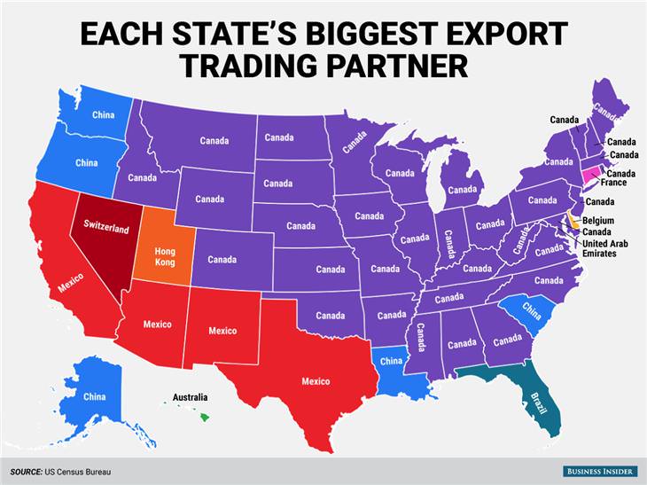
These are the countries that each state exports most of its goods to.
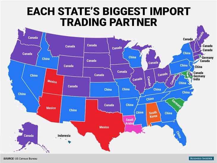
In contrast, this is where the most imported goods come from in each state.
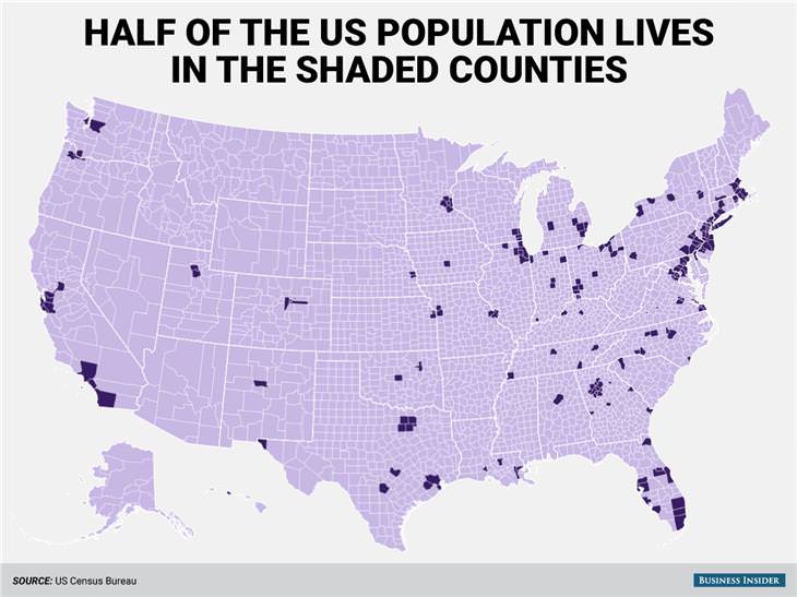
The purple areas represent people living in super-dense cities. These people amount to half of the entire US population.
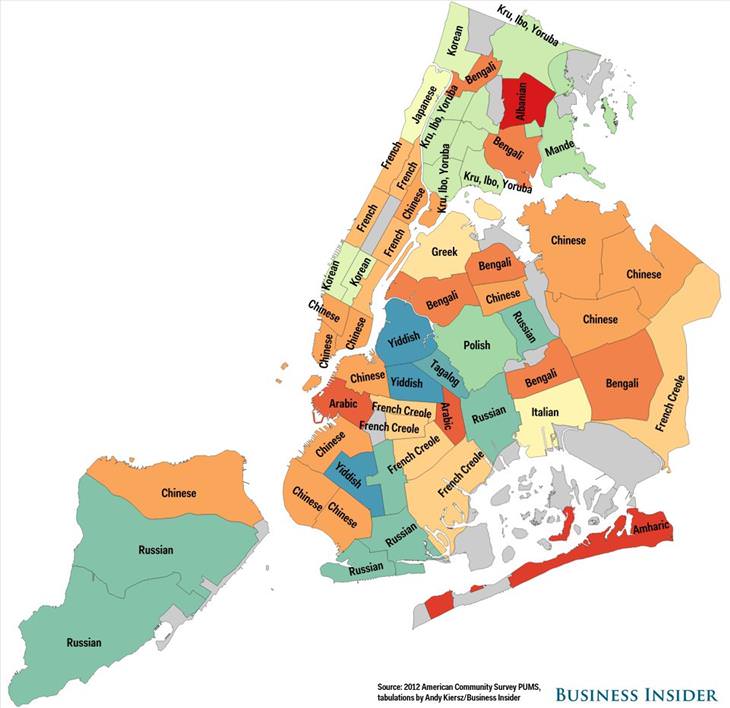
These are the most commonly-spoken languages (excluding English and Spanish) in each New York City neighborhood.